
Understanding User Research Before You Design
Why talking to actual users changes everything. Learn the methods that reveal what people really need, not what you think they need.
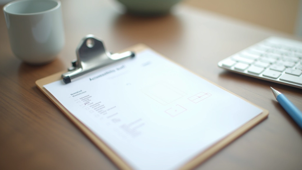
Read MoreMaking interfaces work for everyone: color contrast, keyboard navigation, screen readers, and why accessibility makes better design for all users.
You know that moment when a website just works? When you find what you need without frustration, when buttons respond clearly, when text is easy to read? That’s not luck—that’s accessibility done right. And here’s the thing: it benefits everyone.
About 1 in 4 adults in Malaysia experience some form of disability. But accessibility isn’t just about that number. It’s about designing interfaces that work for people using keyboards instead of mice, for someone reading your site on a 3-year-old phone, for someone browsing in bright sunlight, for someone who’s tired and can’t focus on tiny text. It’s about removing barriers that shouldn’t exist in the first place.
The best part? Accessible design is good design. Period. When you build for accessibility, you’re building for clarity, usability, and performance. You’re not adding extra features—you’re removing friction.


Let’s start with something simple that gets overlooked constantly: can people actually read your text?
WCAG (Web Content Accessibility Guidelines) requires a minimum contrast ratio of 4.5:1 for normal text. That means if your background is dark, your text needs to be light enough that someone with moderate vision loss can read it comfortably. And we’re not talking about edge cases—we’re talking about people sitting in sunny offices, older users with presbyopia, anyone who’s squinting at a screen after 9 PM.
A quick check: take your color palette. Pull up a contrast checker tool (WebAIM has a great one). Test your headlines, body text, button labels. If you’re hitting 4.5:1 or higher, you’re good. If you’re not, you’ve just discovered why some users abandon your site before they even start.
Not everyone uses a mouse. Some people have mobility disabilities that make mice difficult or impossible to use. Others use keyboards for speed and efficiency. Some are navigating your site with a keyboard because their trackpad is broken. The point: if your interface only works with a mouse, you’ve locked out real users.
Keyboard navigation is straightforward to implement. Every interactive element—buttons, links, form fields—needs to be reachable using the Tab key. Focus needs to be visible (that blue outline you sometimes hide? Keep it). Form fields need proper labels that screen readers can connect to inputs. And Tab order should follow the visual flow of your page, not jump around randomly.
The quick test: put down your mouse for five minutes and try using your site with only Tab, Enter, and arrow keys. Can you get everywhere? Can you see which element is focused? If the answer’s no, neither can your keyboard-only users.

Screen readers convert text to speech (or braille) so blind and low-vision users can navigate your site. But here’s what trips up designers: screen readers don’t see your beautiful layout. They see your HTML. If you’ve built your entire site with divs styled to look like buttons, screen readers won’t know they’re buttons.
This is where semantic HTML saves you. Use actual <button> elements for buttons. Use <nav> for navigation. Use <header>, <main>, <article>, <footer> to structure your page. Add alt text to images that conveys meaning (not “image.jpg”). Use proper heading hierarchy: one <h1> per page, then <h2>, <h3> in order.
You don’t need to compromise your design. Your CSS can style semantic elements however you want. But the underlying structure needs to be real and meaningful. That’s how screen readers know what they’re reading.
You don’t need to overhaul everything. Start here with the changes that matter most.

You don’t need to be an accessibility expert to test your work. These tools do the heavy lifting.
Paste your foreground and background colors, get instant feedback on contrast ratios. Takes 30 seconds. No signup required.
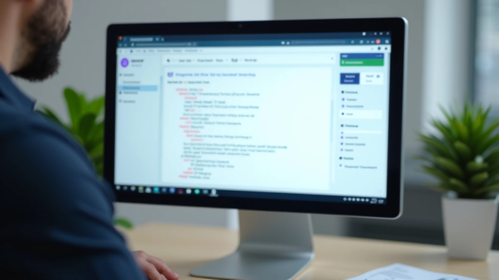
Install it, visit your site, see accessibility issues highlighted. Shows missing alt text, improper heading hierarchy, focus problems—all visual.
Chrome extension that integrates with DevTools. Scans your page, finds violations, explains how to fix them with code examples.
NVDA (free, Windows) and VoiceOver (built into Mac) let you experience your site as blind users do. Worth 20 minutes of your time.
Here’s what happens when you prioritize accessibility:

The shift in mindset is important. You wouldn’t launch a website with broken buttons or text you can’t read. You’d call that a bug. Accessibility should be the same. If your site doesn’t work for keyboard users, that’s a bug. If images have no alt text, that’s a bug. If the focus outline is invisible, that’s a bug.
Start small. Pick one thing from the checklist above. Test it. Fix it. Then pick another. You don’t need to be perfect. You just need to care enough to try.
The users who benefit aren’t edge cases. They’re real people with real needs, and they deserve interfaces that work for them. When you design for accessibility, you’re not adding complexity—you’re removing barriers. That’s good design.
This article provides educational information about web accessibility principles and best practices. While these guidelines are based on established standards (WCAG), accessibility requirements and enforcement vary by country and industry. This content is not legal advice. For specific compliance requirements in Malaysia or your jurisdiction, consult with an accessibility specialist or legal advisor. Accessibility is an ongoing process—standards and technologies evolve, so stay current with the latest guidelines from the Web Accessibility Initiative (W3C).