
Understanding User Research Before You Design
Why talking to actual users changes everything. Learn the methods that reveal what people actually need.
Read MoreStop recreating buttons every project. Learn how to build a reusable design system that saves time and keeps your product consistent.
You’ve been there. Three months into a project, you realize you’ve created buttons five different ways. The navigation component exists in seven variations. Your designer’s just shaking her head at the color inconsistencies.
A design system fixes this. It’s not just a style guide or a component library—it’s the shared language between design and development. When it’s done right, it saves weeks of work across projects. When it’s ignored, it becomes digital debt that haunts every release.
The tricky part? Most design systems never actually get used. They sit in Figma files. They get outdated. Teams bypass them because they’re too rigid or too complicated. We’re going to show you how to build one that people actually reach for.

Before you build components, you need a solid base. This means deciding on your color palette, typography, spacing scale, and iconography. Don’t overthink this phase—you’re not designing for every possible use case yet.
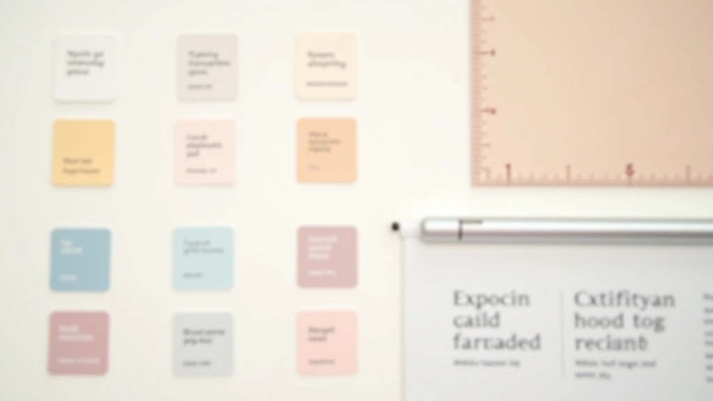
Pick 6-8 colors maximum. Seriously. A primary color, secondary, grays for text and backgrounds, one accent. That’s enough. Typography? Two font families. One for headings, one for body text. We’ve seen designers try to establish 12 colors and four typefaces right away. It never works.
Your spacing scale should follow a consistent ratio. Many teams use an 8px grid system—that means 8px, 16px, 24px, 32px, 40px, etc. This creates visual rhythm and makes responsive design actually possible. Icons? Use a single icon set consistently. Icon Awesome, Material Icons, Feather—pick one and stick with it.


Once foundations are set, start with atoms. Buttons. Inputs. Labels. These are the smallest reusable pieces. For each component, document three things: how it looks in default state, how it looks when you interact with it, and the variations (sizes, colors, disabled states).
Don’t skip the “disabled” state. Seriously. It’s the first thing people forget and it creates accessibility problems. A disabled button needs to look visually distinct—usually with reduced opacity or a different color. Same with error states, loading states, and success states.
Then move to molecules—combinations of atoms. A button + icon together. A label + input + helper text. These are still reusable patterns but they’re slightly more complex. Finally, organisms. The bigger chunks. A form, a navigation bar, a card layout. This atomic approach makes it much easier for developers to implement and for designers to think through variations.
This is where most design systems fail. The documentation’s 200 pages long. Nobody reads it. Instead, keep it brief and visual. Each component needs: one visual showing the component, one paragraph explaining what it is, clear code examples, and edge cases.
Include actual code. If you’re building for React, show the component signature. If it’s CSS, show the class names and modifiers. Developers shouldn’t have to guess how to implement something. And be honest about what the component can and can’t do. If a button only supports text, say that. If it supports icons too, show how.
Pro tip: Update documentation as you ship. Make it a habit. When you modify a component in code, the documentation gets updated in the same pull request. This keeps it accurate and alive instead of becoming a dusty artifact.
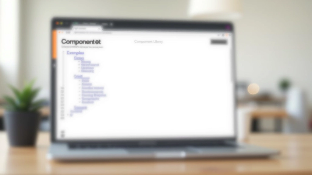
Put the design system where people already work. If your team uses Figma, integrate it there. If they’re building in React, make it an npm package. Don’t ask people to hunt through a separate wiki.
Designers and developers will find gaps. A component that almost works but needs one small tweak. Don’t ignore these. Create a process for suggesting additions or modifications. Show that feedback gets acted on.
When someone uses the system correctly, acknowledge it. When a project ships with zero custom components, that’s a win. Show how using the system reduced development time. Make adoption feel good.
Someone needs to own the design system. Not as a side project, but as actual work. This person reviews component requests, ensures documentation stays current, and manages version releases. It’s not glamorous but it’s critical.
A design system isn’t magic. It won’t make bad design decisions good. But it will save your team from making the same decisions 47 times. It’ll make new hires productive faster because they don’t have to learn your conventions—they’re documented. It’ll reduce bugs because consistent components are tested components.
Most importantly, it creates shared understanding. When your designer and your developer are both looking at the same button component with the same specifications and the same code example, miscommunication drops dramatically. That’s worth building for.
“The best design system is the one your team actually uses. Everything else is secondary.”
Start small. Foundations first. One component at a time. Get feedback early and often. Build it in public so your team sees the system evolving. That’s how you create a design system that actually sticks around.


This article provides educational information about design system principles and best practices. Every team’s situation is different—your specific implementation should be tailored to your team size, project scope, and technical stack. The approaches discussed here are frameworks to adapt, not rigid rules. Consider your unique context when applying these concepts to your work.